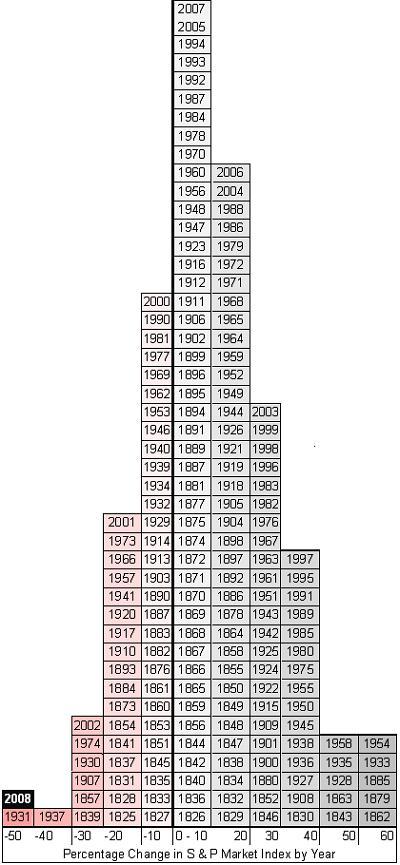
On this chart each block represents a year and each column represents a range of return on the S&P index. Over on the right side are those lucky years where the index has soared upward from 50-60%. In the middle are the more typical years, where the market has risen less than 10%.
That little box on the far left? Yeah, that's this year.
The chart (the idea for which comes from a similar chart prepared by Value Square Asset Management, Yale University) has a wealth of interesting information. Because the S&P is a much broader index of market activity, it's not quite as prone to crazy moves as the Dow. It's also not as easily manipulated by the "let's just trade out these exhausted brands for a couple of up and comers" means by which the Dow's value is sometimes inflated.
On the chart you can see that the decline that began in 1929 didn't really reach it's nadir until 1931, following which there were wild swings bringing a record positive move in 1933 and a second crash in 1937. The movement of the market from there through the mid-40s is series of gradually dampening swoops más y menos. How helpful that will be as a model for what happens post-2008 isn't clear. But short of 1931, there's no other year in the S&Ps history comparable to 2008. Let's just hope that we're at the 1931 (or 1937) stage of this downturn, and not in 1929, okay?
And hey, how many of you knew the S&P had been around since 1825?
Nothing puts our economy in more perspective that this chart.
No comments:
Post a Comment